Your Cart is Empty
When it comes to choosing wall colors, there's no set of rules or recommendations - there's only inspiration. First, do you have any room furnishings that you love? Let those furnishings inspire your color selection. A favorite piece of wall art, a rug, toss pillows or the upholstery fabric may lead you in the right direction. Don't try to match colors- blending or complementing is much more interesting and looks less contrived and more natural. To help one color stand out, use contrasting color as background- for example, put black, red or blue furnishings against a bright wall in red, yellow, green or orange to show off each color. Try to keep the intensity of the colors the same so that no single color looks pale or washed out against another.

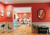
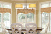
The inspiration for the kitchen walls? The floor rugs
If you have no furnishings for the room and still need a starting point, think about the effect you are going for- warm and cozy or cool and open? Sophisticated or country? Certain color palettes lend themselves to certain effects. Colors that give off warmth have reds and oranges in them. Apple greens, true soft yellows and creamy white make rooms look fresh and new. Medium blues, taupe and beige are easy to live with and are commonly used in large and small degrees in almost every home. Men seem to prefer them. Dark, rich colors including purple, burgundy, navy blue and chocolate brown give off a dramatic, elegant, sophisticated look. Gray, blue gray and pure white give off a cool, open feeling. Color and effect are partners- let the effect you are going for guide you to the correct color partner.
Don't forget to carefully consider color for your ceiling. There's no reason to leave such a large area in stark white or to match the ceiling color to the wall color when a contrasting color will add a decorative punch instead. Ceilings are important to room decor- they are what a matching purse and shoes are to a designer dress or what a beautiful tie and pocket square are to a pin stripe suit- the finishing touches that turn average looks into show-stoppers.
With pumpkins, golden yellows and neutral colors including whites and browns, try creamy white trim and very pale blue on the ceiling. A little bit of cool color paired with warm walls makes a great contrast. Strong, dark colors including green and navy blue as well as cool tones in gray come to life when paired with whiter trim and warm ceiling color in pale peach and pink. Keep rich tones of deep red, purple, medium blue and burgundy elegant with golden yellow on the ceiling and creamy white on the trim.

Finally, the amount of natural light and artificial light in a room will dramatically influence color and effect. So when you are choosing your colors, be sure you test them in the room under existing light conditions before painting all the walls. You may need to adjust the intensity of your chosen color so that it gives the desired effect with your room lighting. If you are planning to add new lighting to the room, choose your final color after the new lighting is installed. From the hundreds of designing dilemmas we receive, there's no shortage of questions about color - how to choose it, how to use it and where.

Comments will be approved before showing up.